



Amplify
AI creative marketing
Turning a Shopify Catalogue into a Creative Pipeline for US and European Markets
Amplify is an agent that connects to a Shopify store and turns its catalogue into ad creative: images and video, in batch, published back to the store. Built for merchants whose constraint is volume, not skill.
Year
2026
Duration
6 weeks
Category
B2B
Platform
SaaS (web)
Status
Live
Read more

$8K
Monthly revenue
4K+
Creatives published
88
Stores connected

Part 01
Overview
Different from Flyr
Flyr worked, so the obvious move was to translate it. Same flow, English copy, dollar pricing.
But Flyr was built around a seller who couldn’t describe what they wanted. A merchant in Ohio or Rotterdam can, and plenty of them have brand guidelines to prove it. Every constraint the product was shaped around had disappeared, and so had the reason for its shape.

Why this market, and not the one we already had
1
The product costs more to run.
2
The need only recurs where people buy ads.
3
That price point doesn’t exist in India.
Two very different user bases
India
Indian market
1.2 lakh Shopify accounts
10–12 SKUs per store
70–100 creatives needed per month
A marketing tool can charge up to ₹650 (~$7)

US
US market
11.5 lakh Shopify accounts
50–60 SKUs per store
300–400 creatives needed per month
A marketing tool can charge up to $500

India vs US, per the research
Shopify accounts
India
1.2L
US
11.5L
SKUs per store
India
10–12
US
50–60
Creatives a month
India
70–100
US
300–400
Why the integrations matter
If the point of the creative is to run as an ad, the product shouldn’t stop at a download. Amplify writes back to Shopify, and connects to Meta so campaign creative can be pushed without the merchant exporting anything.
Instagram isn’t connected yet. The loop closes on two channels but not the third. That’s a real gap in the product, not a rounding error.
Who sees it
Intent
The question it answers
Attention available
Its job


Part 02
Research
Key questions that needed answers
Q1
If they can already make a good image, what’s actually stopping them?
Q2
How does a creative actually get from idea to live listing?
Q3
How much do they want to decide, and how much do they want handled?
Q4
Would anyone let software write to their live store?
All four needed the same thing: going and looking. So I started with the stores, then the merchants behind them.
The research
20–30 studies with merchants across the US and Europe. Not about images, but about how a product gets from a supplier into a live listing with a photo attached, and what goes wrong in between.
Because we sold this ourselves, one conversation at a time, I was also on every sales call and every onboarding. That’s an unusual amount of contact with the people you’re designing for, and it’s where most of what follows came from.
How the business runs
Nobody could describe their process in one go. Everyone could describe it if you asked what happened to one specific product. So I mapped it product by product, and the same nine steps came back every time.

What this told us
Break A is a gap that never gets filled. Step 3 is the one with no deadline attached, so it’s the one that slides. A product that went live with a supplier photo tends to stay that way. Nobody decided that. It’s just what happens when the listing already works well enough.
Break B is a loop that can’t be run often enough. Steps 6 through 9 have to repeat every few weeks per ad set, forever, and there is no version of a small team that keeps up with it. So the creative gets old and the merchant watches the numbers fall.
Insights from the user research

They don’t need help making a good image. They need four hundred of them, and again next month.
Volume became the product, not quality. Batch generation, batch editing and batch publishing stopped being power-user features and became the primary interaction.

Making the image was the fast part. Everything around it was the job.
Amplify had to own the whole loop, not just the creative step. That’s why it connects to Shopify and writes back instead of handing you a download.

They’ll hand over the work. They won’t hand over the judgment.
Real editing controls, on purpose: the lighting, crop and colour that Flyr took away. And an approval step that can’t be skipped.

The store is revenue. Nothing writes to it without a human saying yes.
The agent proposes; the merchant publishes. Autonomy was never the goal, and the queue exists because of this conversation.
In India I was solving for a seller who couldn’t make one good image.
Here, the merchant can make a great one. They just can’t make enough of them.
Who this is for
A Shopify merchant in the US or Europe running 12–14 SKUs, with a team of three and no marketing hire. They’re spending on paid social, so their creative burns out on a schedule. New stock arrives every week or month and goes live with whatever image the supplier sent.
They know what good looks like. They’ve often paid for it before (a photographer, an agency, a freelancer on retainer) and stopped, because the maths stopped working at catalogue scale.


Part 03
Problem
The problem I was solving
These merchants aren’t short of taste, tools or ideas. They’re short of hours, and the shortage compounds: every new product needs images, every ad set needs fresh creative, and every one that gets made has to be reviewed, uploaded and attached to a listing by hand.
The reframe
What I was solving for wasn’t making creative.
It was closing the distance between a product sitting in inventory and a finished creative on its listing, without the merchant having to start anything and without software ever publishing on its own.
Problems to solve
01
Review, not generation
02

Uploading, not making
03
Marketing vs listings
04

No feedback loop
05
Creative decays weekly
Why the tools that exist don’t work here


They’re destinations. This is a connection.
They end at a download. This ends on the listing.
Every one of them hands back a file. The part merchants called the actual work, getting that file onto the right product on the live store, is left to them. One-click write-back to Shopify isn’t a convenience. It’s the half of the job nobody else was doing.

They style from a library. We ground in a category.
Templates and presets come from what looks good in general. Amplify reads what’s actually running and spending in that merchant’s own category: competitor creative and the Meta Ad Library.

Part 04
Design
Decision 1: The store
A direct connection to Shopify, so the merchant’s catalogue arrives on its own: connect, and the catalogue is populated.

1
Rejection has to be cheap and specific.
2
Bulk approve with confident defaults. The common case is “these are all fine”.
3
Anything rejected has to teach the system something.
4
The queue should never feel intimidating. 400 pending items is a burden, not a benefit.

Decision 3: The control
On Flyr I removed lighting, lens, camera angle and colour grade, on the grounds that the seller had no basis to choose and every control was a chance to make the output worse.
This merchant has a brand, a palette, a look they’ve paid for before, and the vocabulary to describe it. Handing them three questions would read as a toy. The same reasoning produced opposite answers, because the reasoning was never about how many controls are correct. It was about whether the person’s judgment beats the system’s.

Design iterations
Dashboard

The flows
Image creation


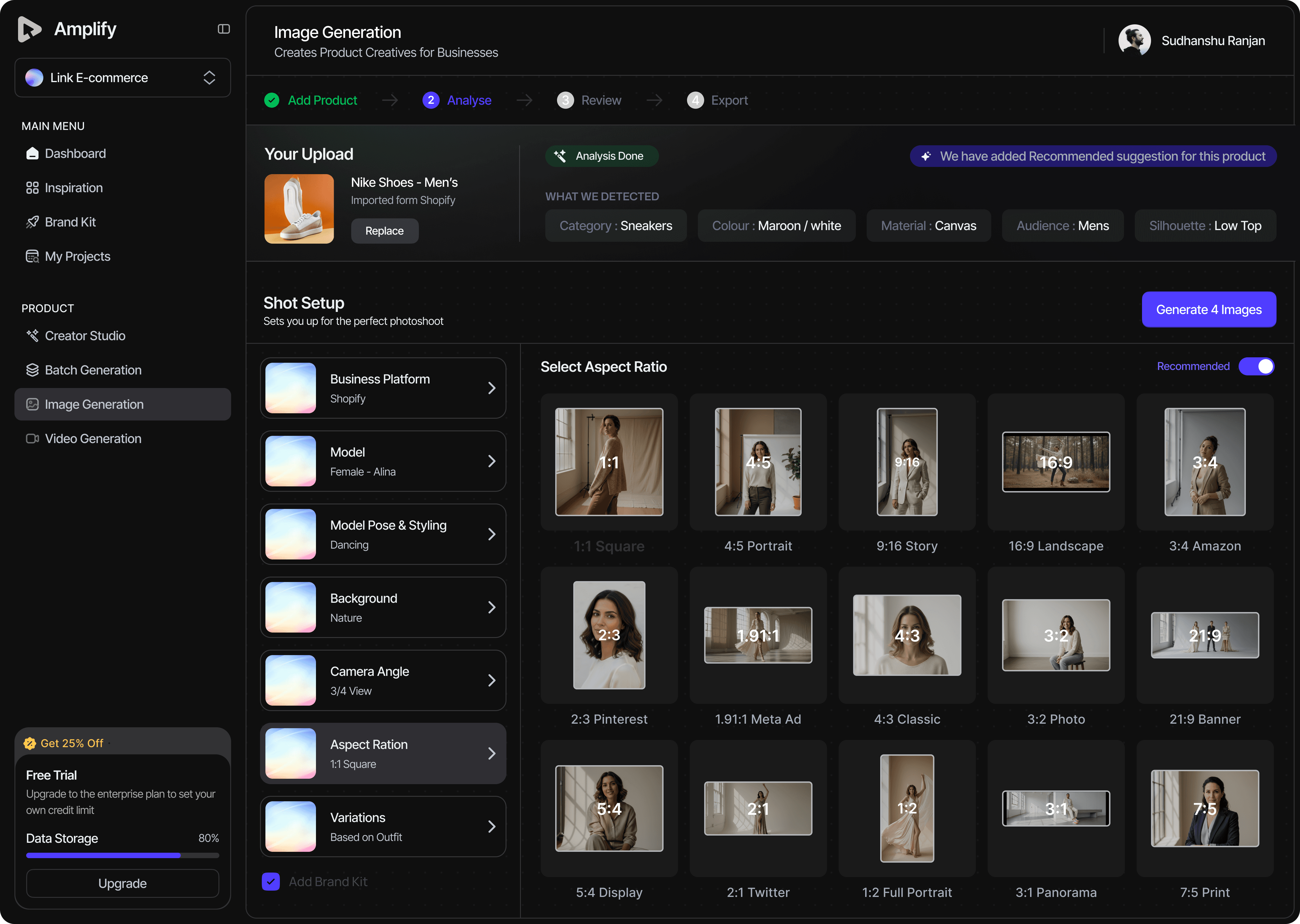


Batch generation


Brand kit
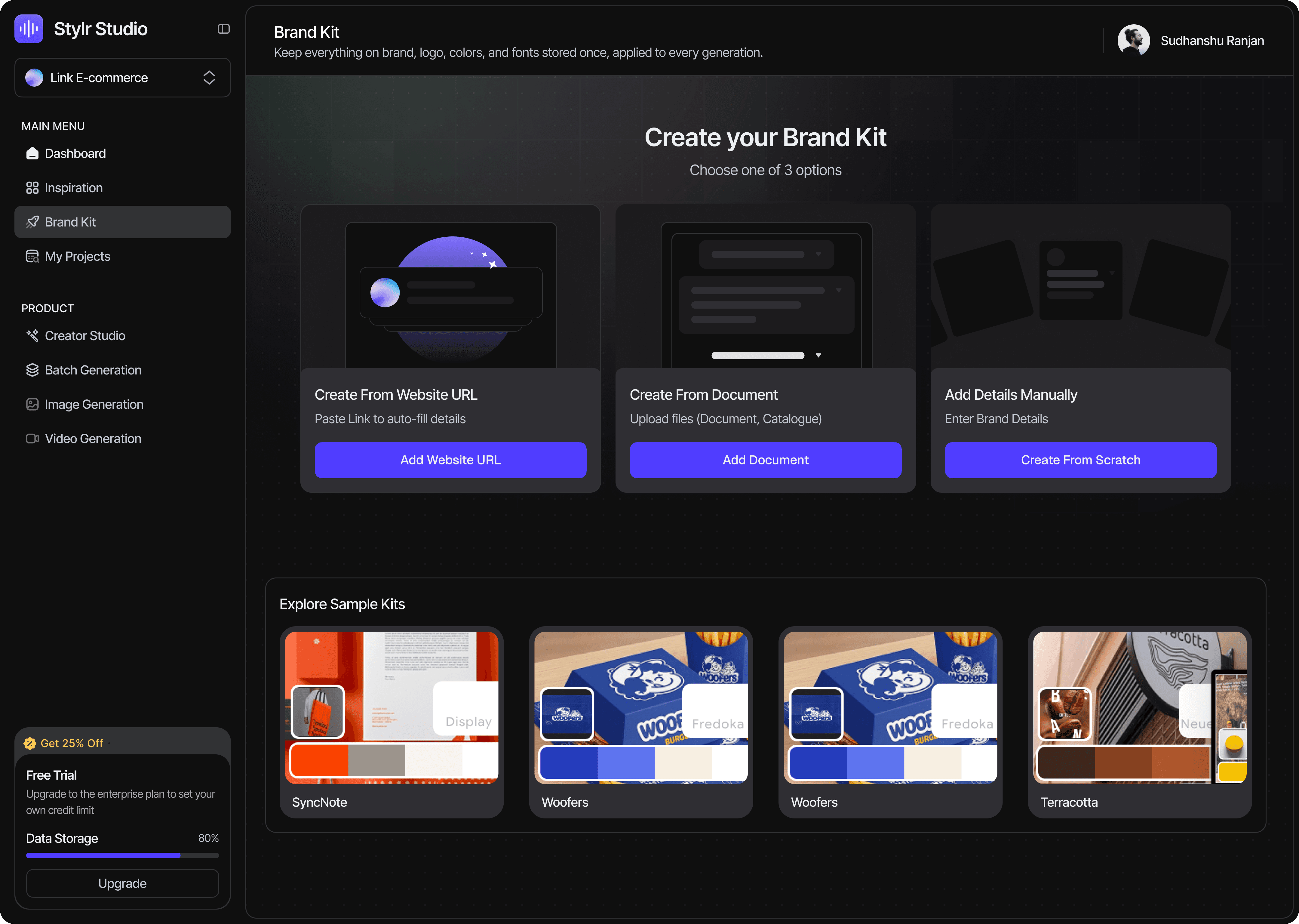


Editing


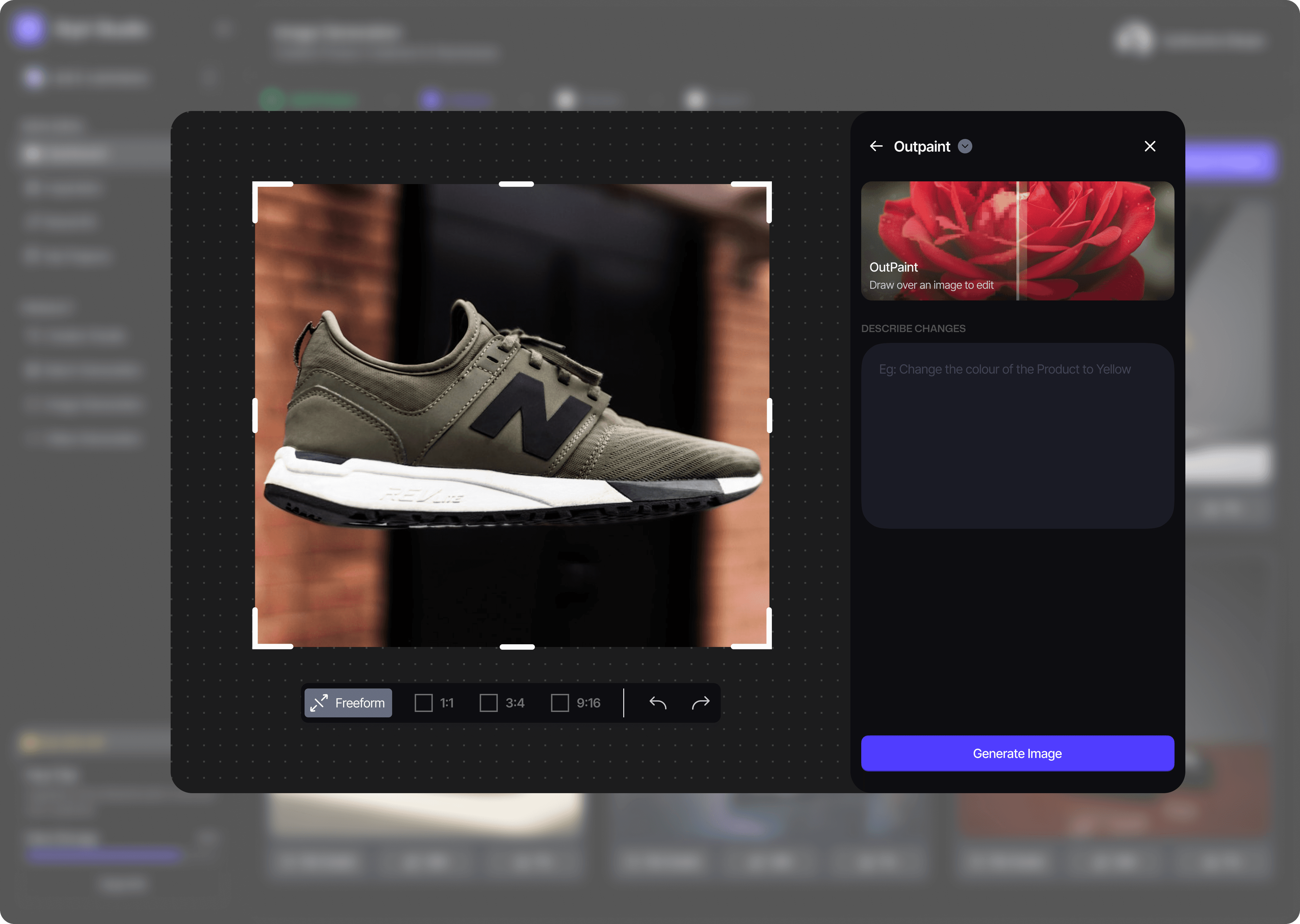


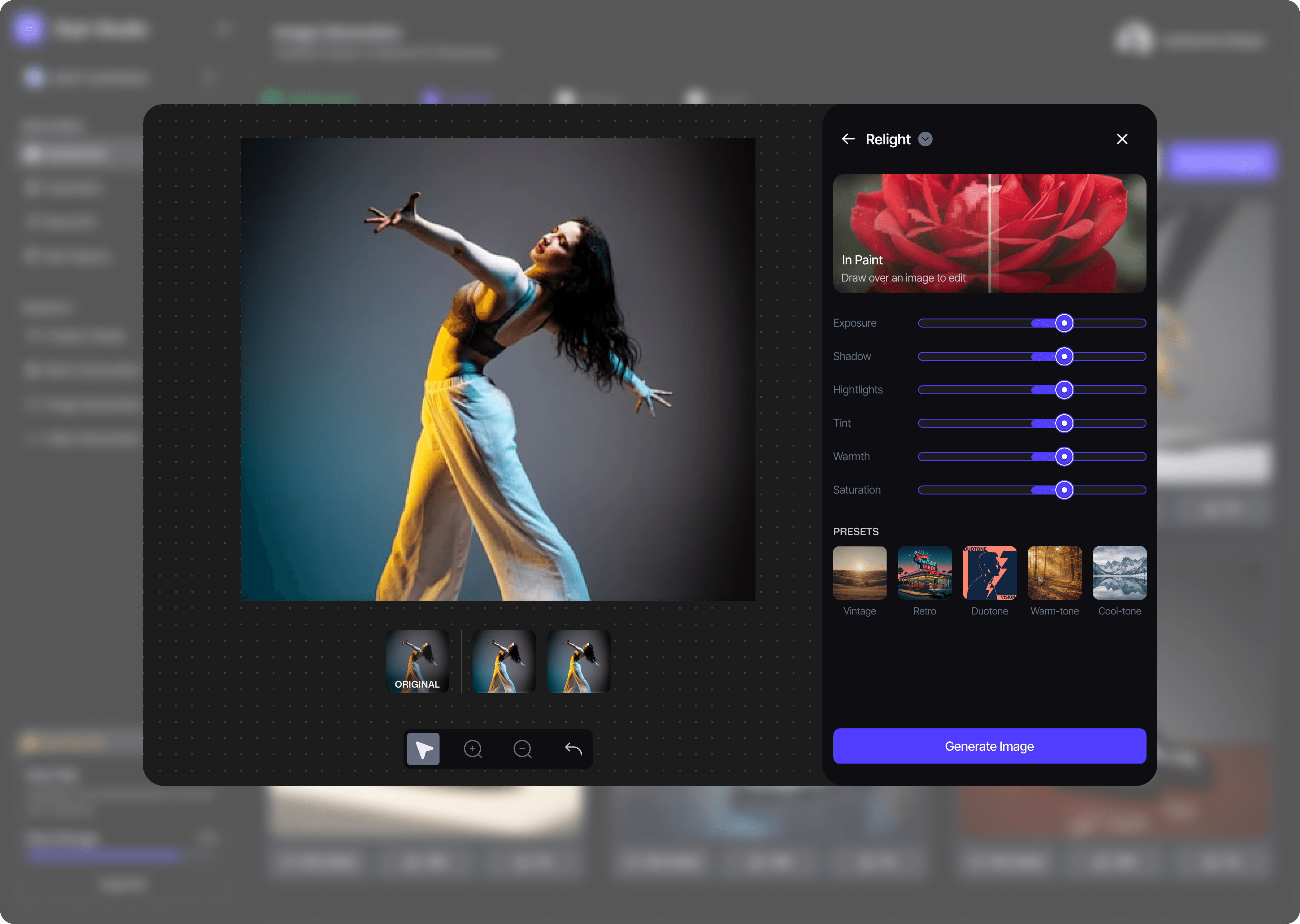

Catalogue management




Part 05
Learnings
My learnings
1
I thought I could translate Flyr. Almost nothing transferred. The two users wanted opposite things.
2
I thought making the images was the hard part. Uploading them was. I’d designed the fun step, not the slow one.
3
I thought more automation would help. It gave merchants more to review; faster isn’t help if a human still has to say yes.
4
I thought connecting Shopify would be the easy step. It was the scariest thing we asked for. I was asking for their revenue, not their data.

