Flyr
AI image creator
Replacing the Product Shoot for India’s Small E-Commerce Sellers
Flyr is a mobile app that generates ad creative from a single product photo. Small sellers who can’t afford a photographer upload one phone photo and get images and short videos of their product on a model, built around the occasion they’re selling into.
Year
2026
Duration
4 weeks
Category
B2B
Platform
Mobile
Status
Live
Read more

3Cr+
Monthly revenue
16K
Paying users
58%
Month-3 retention

Part 01
Overview
From any random click to e-commerce-ready images
The business bet
In November 2025, one generated product image cost us ₹1–2.50 plus GST. Eighteen months earlier it took a photographer, a model, a studio and a day. The same tooling made the platform cheap to build.
We picked the buyer before we picked the problem. The filter was willingness to pay, not depth of need. Plenty of people want free AI images. Almost nobody pays ₹700 a month for them.
Choosing the buyer before we chose the problem
Ruled out
Casual consumer, tier 3–4
Needs AI-generated images
Won’t pay for them
No revenue attached to the output and free alternatives everywhere. For them, images are a novelty, not a need.

Our buyer
Small business, 3–4 people
Needs AI-generated images
Will pay for them
Output feeds directly into sales, they already spend on photography, and they have income to spend.


Part 02
Problem
Key questions that needed answers
Q1
Where do they sell, and does every channel want the same thing?
Q2
How does a product get photographed today?
Q3
What happens when the seller is the one doing the selling?
Q4
Can they tell a good image from a bad one, and say why?
All four needed the same thing: going and looking. So I started with the listings, then the people behind them.
The observation
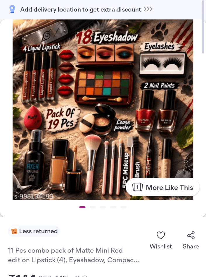
I was scrolling Meesho, looking at kurtas under ₹500. Every seller had the same three photos: the garment flat on a bed, the same garment slightly crumpled, and a close-up of the fabric. Different sellers, same three photos. Forty listings in, I couldn’t tell any of them apart. Neither could a buyer.
These sellers aren’t careless. Most are two or three people running a business out of one room. A basic product shoot costs ₹200 per SKU; one with a model costs ₹500. They add 3–4 new SKUs a month. The arithmetic has never worked for them, so they shoot on a bedsheet with a phone and move on.




The platform problem
Then I found the thing that didn’t fit. The same sellers were moving the same products, at the same price, over WhatsApp, and moving them well. Same photos. Same product. One channel worked; the other didn’t. So the photos weren’t the whole problem. Something else was carrying the sale on WhatsApp and going missing on the marketplace.
On WhatsApp, the seller is the salesperson.
On a marketplace, the photo has to be.

How the business runs
Flyr’s seller is two or three people, often one family, running a business out of a single room in a tier 2–4 city. They add four or five new SKUs a month. That’s not many, so each one has to earn its place. And they list the same stock across Meesho, Amazon and Myntra.
Those three aren’t interchangeable. They’re a ladder, and photography is what gates it. Meesho will take almost any image. Amazon has standards. Myntra has real requirements, like model shots and background specs. A seller who can’t produce that imagery doesn’t get listed there at all, however good the product is.
So the cost of bad photography isn’t only lost sales on the listings they have. It’s being locked out of the channel where their margin would be best.


Part 03
Research
Insights from the user research

Photography isn’t how they compete on a marketplace. It’s how they qualify for one.
Output could never be just “a product photo”. It had to be whatever each rung of the ladder demands. That’s where the four formats came from, including the branded status creative no ad tool builds.

There is no second photo. What they have is all they will ever have.
One photo in, permanently. Every idea that quietly depended on “take a better one” (guided capture, retry prompts, quality gates) came off the table in the same week.
They don’t sell the product. They sell the certainty around it.
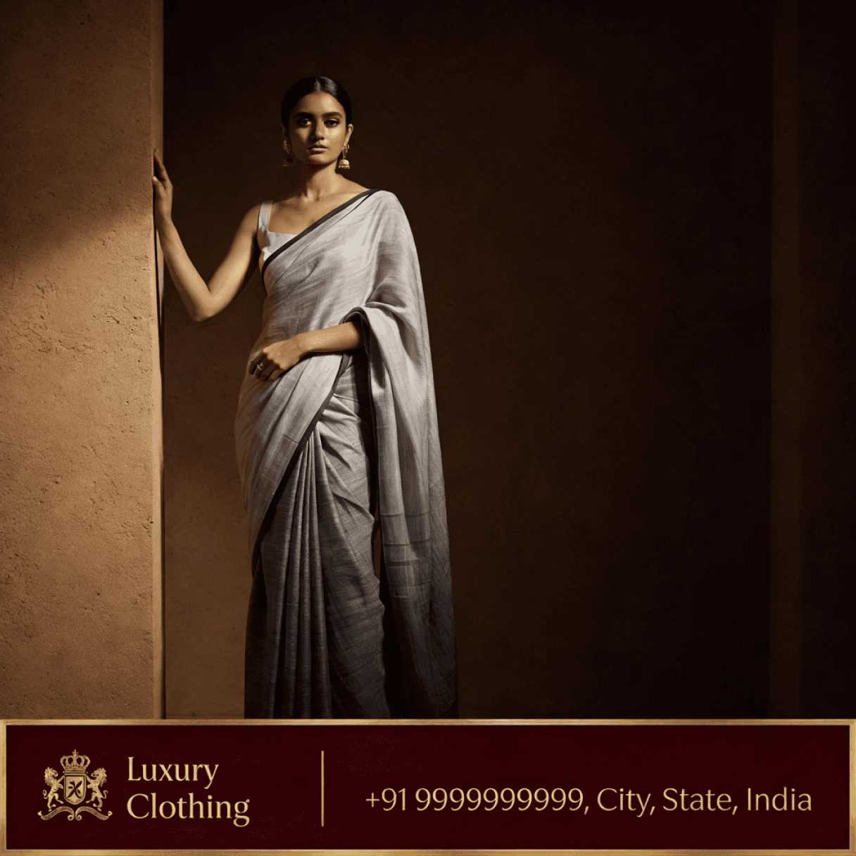
The image had to carry context, not just quality: an occasion, a person wearing it, a sense of where it belongs. “Make the photo sharper” stopped being a plausible answer.

They know exactly what they want. They just can’t say it first.
Asking them to describe wants the one thing they can’t give. Showing them something to react to plays to what they’re best at. Choose an outcome, don’t configure an input. Every later decision came from that.
The reframe
What I was solving for wasn’t better images.
It was getting a seller who can’t describe what good looks like to a publishable creative, across platforms.

What the design had to survive
Constraints the users brought
Digital literacy
Sellers skim. Many read English slowly; some barely at all.
Design vocabulary
“Lifestyle” and “editorial” mean nothing. They can describe the image.
Need for control
Having a say in the image makes them feel they control the output.
Units of product
Four or five new SKUs a month, worked on in bursts between orders.
Constraints the system brought
Systematic prompt setup
The prompt line-up had to absorb customisation without destroying the intent of the seller’s product image.
A wrong image costs more
A creative showing detail the product doesn’t have gets ordered and returned, and the seller eats the shipping and the rating.
Generation isn’t instant
An 8-second server round trip on a budget Android over patchy 4G. A dropped connection mid-generation is normal, not an edge case.
Problems to solve
01

One photo in, one photo out
02

Three decisions, not thirty
03

Nothing to read
04

No vocabulary to learn
05
Faithful, not flattering
06
Right the first time
07

Works across platforms
08

Builds in trust
The ideal flow

01
Upload

02
Select a style

03
Customise

04
Generate
Competitor analysis
What they share is an assumption about who’s holding the phone: background removal, AI shadow, recolour, product staging, brand kits, instant resize, batch export.
That’s the right product for a Shopify seller in Austin with some visual literacy and an afternoon. It’s the wrong product for a two-person shop in Meerut adding four SKUs a month between orders. Not because the tools are weak, but because every one of them asks a question our seller can’t answer.
They hand you tools. We had to hand over taste.
PhotoRoom gives a seller background removal, AI shadows, recolour and product staging, then trusts them to compose something good. Our seller has no reference for what good looks like.

They put the product on a background. We put it on a person.
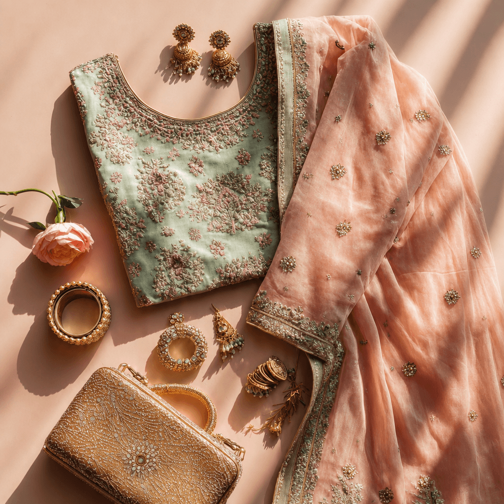
Editor tools stage a product in a scene. For apparel and jewellery in India, the model is the sale. A kurta on a hanger and the same kurta worn are not the same listing, and Myntra won’t take the first one at all.

They format for storefronts. We format for status.
Instant Resize covers Instagram, Amazon and Shopify. It misses the channel these sellers actually own: WhatsApp status, posted several times a day to people who’ve already bought once. That’s why Flyr sets the shop’s branding into the image itself.
What success would look like
01
A high publish rate, without editing
02

High retention through month three
03
Creatives end up on live listings

Part 04
Design
Decision 1: What a shoot actually produces
We opened with two categories, clothing and jewellery, because research said that’s where the gap between what a seller could shoot and what they needed was widest. Everything else came after: electronics, accessories, art and craft, kids, food. Category isn’t a label on the output. It changes what the system does.
What Flyr makes: four formats

Image

Video
Short clips on a model. Later removed, see “Video as a feature”.

Catalogue

Branding
Decision 2: How much customisation
Generation models expose dozens of parameters: lighting, lens, pose, colour grade, aspect ratio, camera angle. Every one is a decision the seller has no basis to make, and every one is a chance to produce something worse than the default.
The obvious move is to strip all of it out and fully automate. We tried. Sellers rejected it. It’s their product and their customer, and handing over the entire decision felt like handing over the shop.
Who gets to direct
Model gender
Model type
Scene
Occasion
Pose
Aspect ratio
Business details
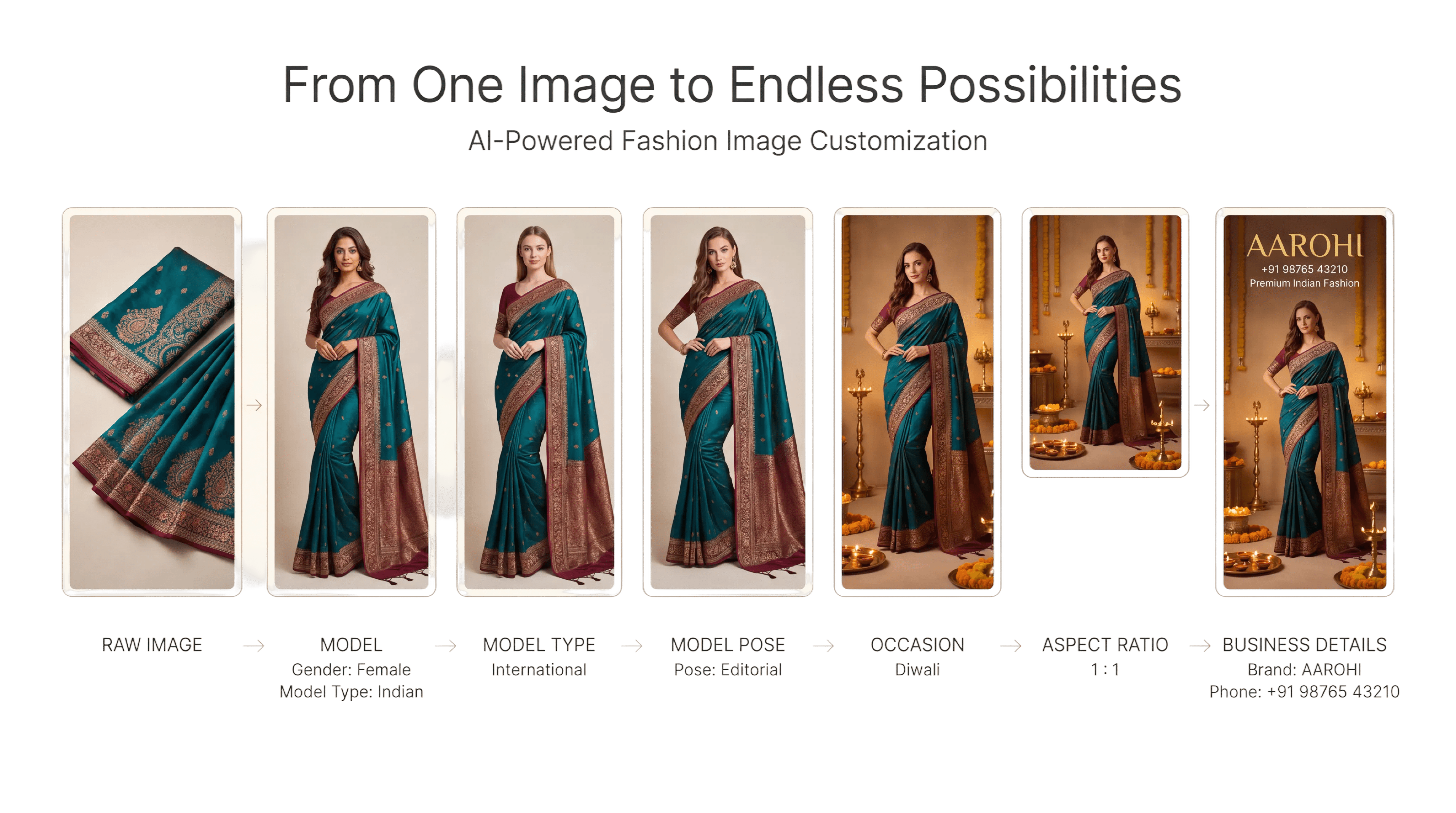
What we can now conclude

Design iterations
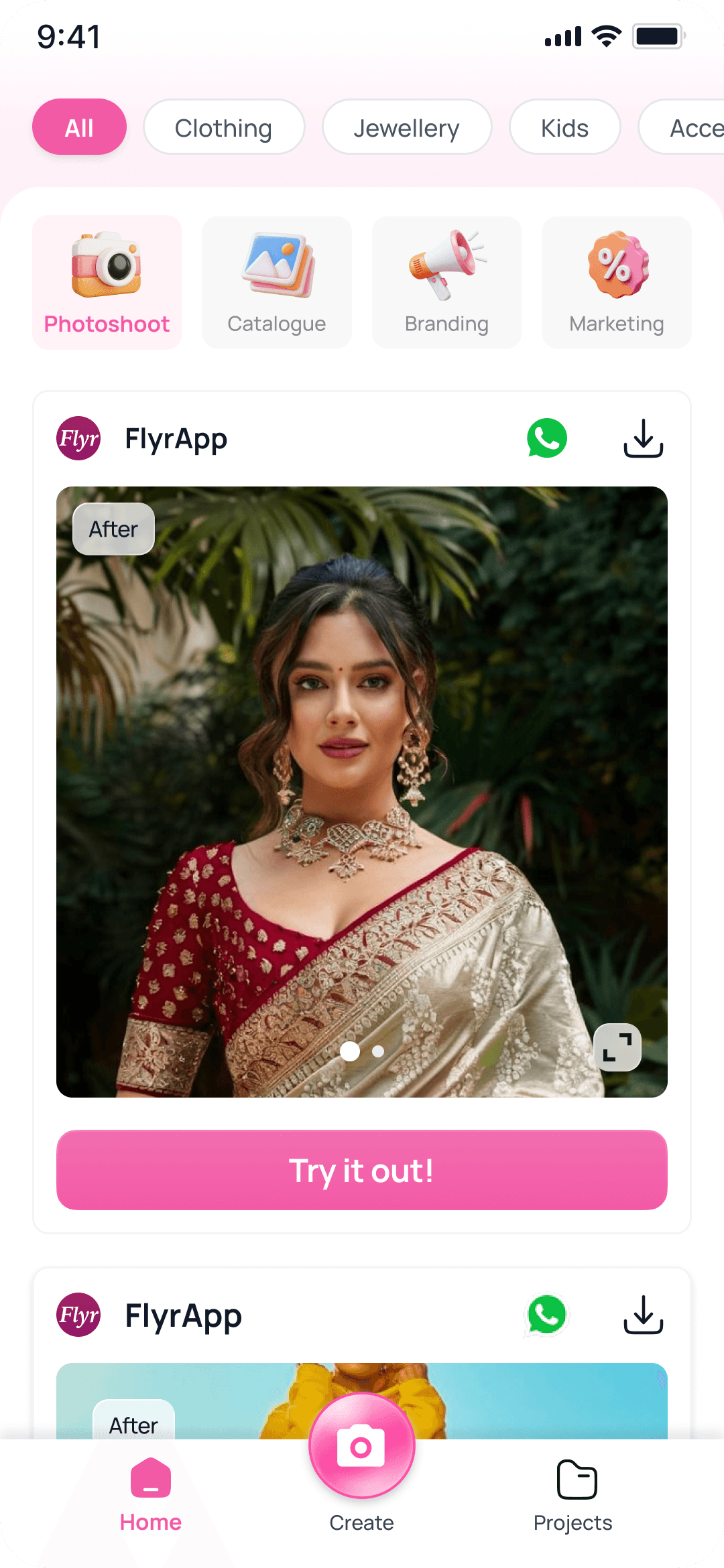
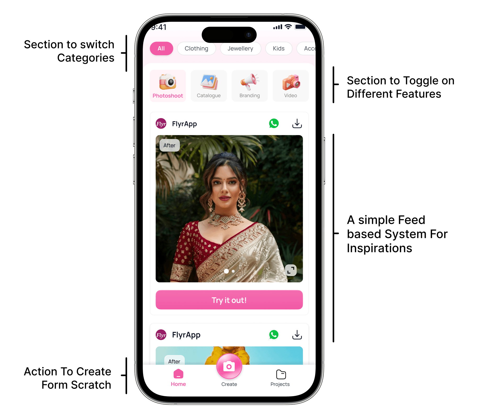
Home screen: three directions and a refinement. Screens 1 to 3 are different organising ideas, screen 4 refines 3.




The creation page
Eighteen sellers, moderated sessions, in person and remote.
Everyone brought their own product. Not a sample photo or a stock SKU, but something they were actually trying to sell that week. That was the one part of the setup I was strict about, because control choices mean nothing without a real buyer in mind. Asked to pick a model for someone else’s kurta, a seller shrugs. Asked to pick one for their own, they have an opinion immediately.
Model face
Special instructions
Aspect ratio
Business details
Clothing settings

Creation page iterations


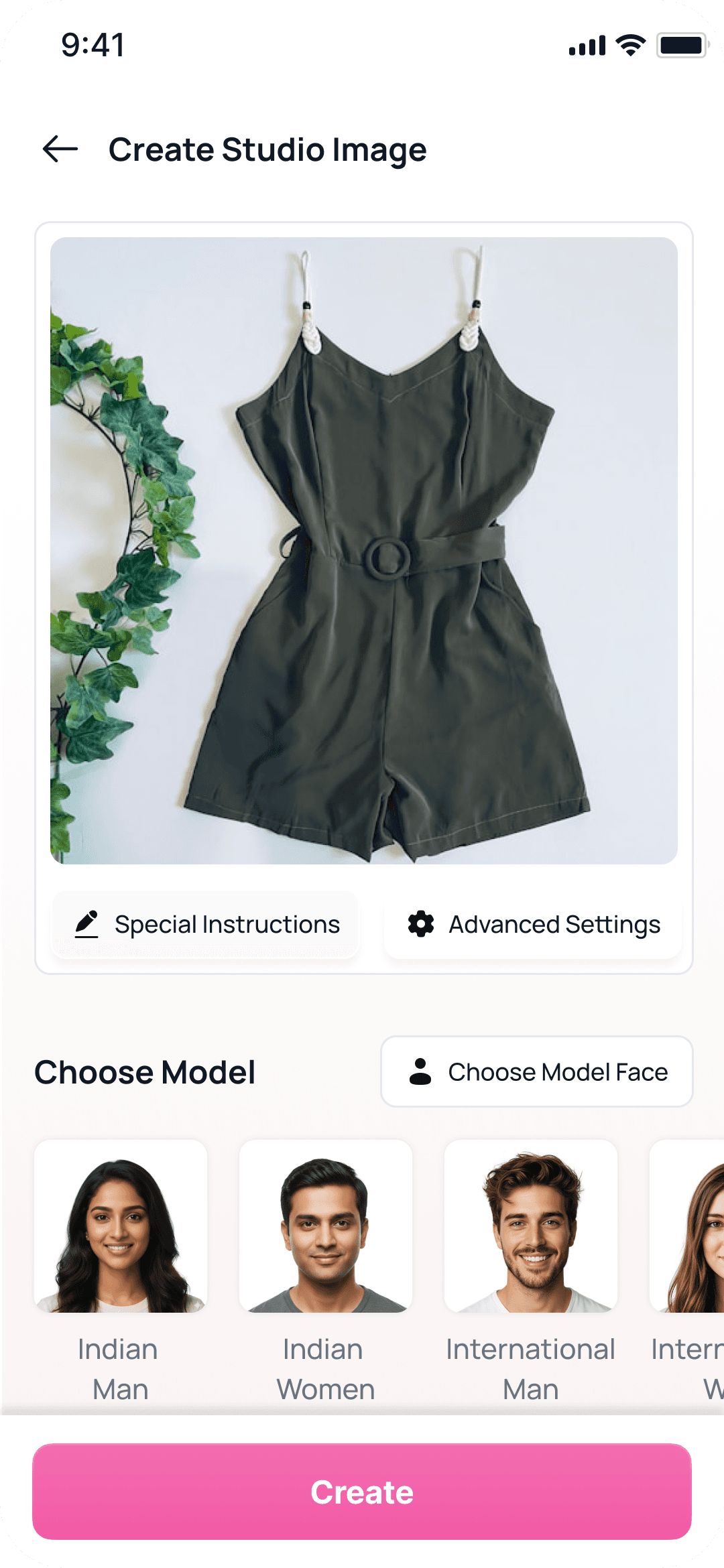

Image generation flow
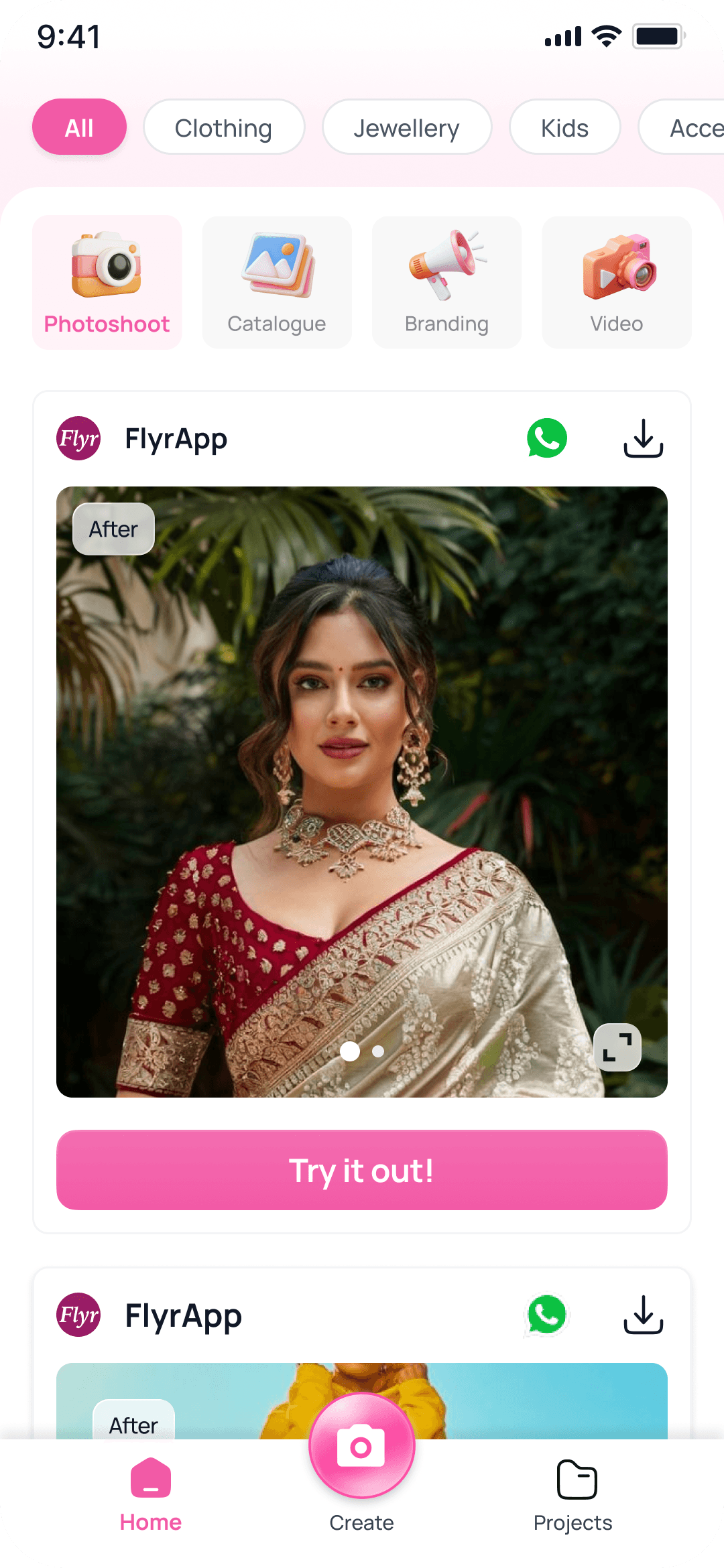


Part 05
Impact
Where I was wrong about the market
I was confident clothing would be the entry point and the revenue driver. It’s the biggest category, the most visual, and the one where bad photography costs the most.
Research disagreed. Jewellery came back just as strong, for a reason I hadn’t considered: a jewellery seller’s product is small, reflective and almost impossible to shoot well on a phone, so the gap between what they could produce and what they needed was wider than in apparel.
Share by category
Where generations actually went
62%
Clothing
25%
Jewellery
13%
Everything else
Impact
Phase 1 · Dec 2025 to Jan 2026 · Photoshoot + branding
8K+
Images generated per day
36%
Retention to month 3
46%
LTP
Phase 2 · Feb to Jun 2026 · Catalogue added
20K+
Images generated per day
56%
Retention to month 3
55%
LTP
Video as a feature
We tested video with new sellers (1.25% of the target group) and watched month-1 acquisition and month-2 activation.
Each video cost 8 credits to generate, so two videos cost the same as sixteen images. Sellers noticed, and it annoyed them. The problem was clear enough that we removed the feature altogether.


Video, while it lasted
52%
LTP
22%
Month-2 activation
1.2
Videos per user
The new scenario

Marketing posters as a feature
Flyr v1 made the product look like it had been photographed properly. Marketing content makes the image speak. It carries a price, a reason, a bit of urgency, the way the seller does when he’s selling in person.
Offer and price
₹499. Two left. Festival rate. The number, on the image, where the buyer is already looking.
Product highlight
One thing about the product, stated plainly: the fabric, the fit, the weight, the warranty.
Sales and urgency
New stock, last day, limited pieces. The reason to act now rather than later.

Marketing posters
57%
LTP
66%
Month-2 activation
6.11
Posters per user
Video vs posters
Month-2 activation
Video
22%
Posters
66%
LTP
Video
52%
Posters
57%
Made per user
Video
1.2
Posters
6.11
A feature no one asked for
Open Instagram, search jewellery, and you get a wall of it. Nobody teaches you how to use that screen. You scroll until something stops you, and then you know what you want.
So the feature currently in testing is that screen, inside Flyr. A seller opens their category and gets a wall of finished creative: Indian models, international models, studio, street, festive. They tap the one they like. They upload their product. They get their product, in that pose, in that scene.


Where it landed
Final · Marketing posters + image swap
29K+
Images generated per day
62%
Retention to month 3
58%
LTP
How each phase moved the numbers
Images per day
Phase 1
8K+
Phase 2
20K+
Final
29K+
Month-3 retention
Phase 1
36%
Phase 2
56%
Final
62%
LTP
Phase 1
46%
Phase 2
55%
Final
58%

Part 06
Learnings
What this taught me
1
I thought the problem was photo quality. It was the seller’s absence. I was fixing the symptom, not the problem.
2
I thought removing their decisions would help. They rejected full automation: less effort is not less control.
3
I thought the design work lived in the interface. It lived in a layer nobody sees, so I stopped counting my work in screens.
4
I thought video would be the unlock. Catalogue was, 22 points to 8. The unit of work beats the exciting feature.